Website redesign for PMI Silesia Branch
This project was delivered pro bono for a non-profit organization. Due to limited time and the lack of budget for user research, design decisions were based on an analysis of the existing website, Nielsen’s usability heuristics and UX best practices.
CLIENT
PMI Silesia
Website
PROBLEM
The PMI Silesia website did not effectively support users in quickly understanding the organization’s mission or finding key information such as events, membership, volunteering opportunities and educational initiatives. An unclear information architecture and the lack of well-defined user journeys made it difficult for both existing and potential members to engage with the organization
SOLUTION
The solution was a redesign of the PMI Silesia website focused on simplifying the information architecture, improving content readability
and creating clear user journeys
MY ROLE
designed a clearer and more intuitive navigation structure
improved information hierarchy and content clarity
highlighted key section hierarchy and CTAs
applied responsive design principles and UX best practices
competitor analysis & benchmarking
basic design system
low-fidelity wireframes
high-fidelity wireframes
copywriting
TEAM
Project Manager, Developer, Graphic Designer, UX/UI Designers
Inspiration and competition analysis
Agenda layout
Conclusions after inspiration and competition analysis
Clear Content Structure - websites of organizations and communities often organize information into distinct thematic sections. This approach enhances readability and allows users to quickly find key information such as events, membership details, or volunteering
Agenda as a Key Element of Event - conference websites frequently highlight the agenda as a central feature of the user experience. Providing clear timelines, speaker details, and session descriptions helps users understand the value of attending at a glance
Simple Visual Hierarchy and Scannability - Modern websites prioritize clear typography, concise content sections, and layouts that are easy to scan. This reduces cognitive load and improves overall usability
Planning structure
Content models
Based on an interview with the client and a website audit, we prepared content models.
Thanks to them, we were able to plan consistent and intuitive user experiences, combining content strategy with effective information management.
We then transformed the content models into an intuitive information architecture.

Information architecture

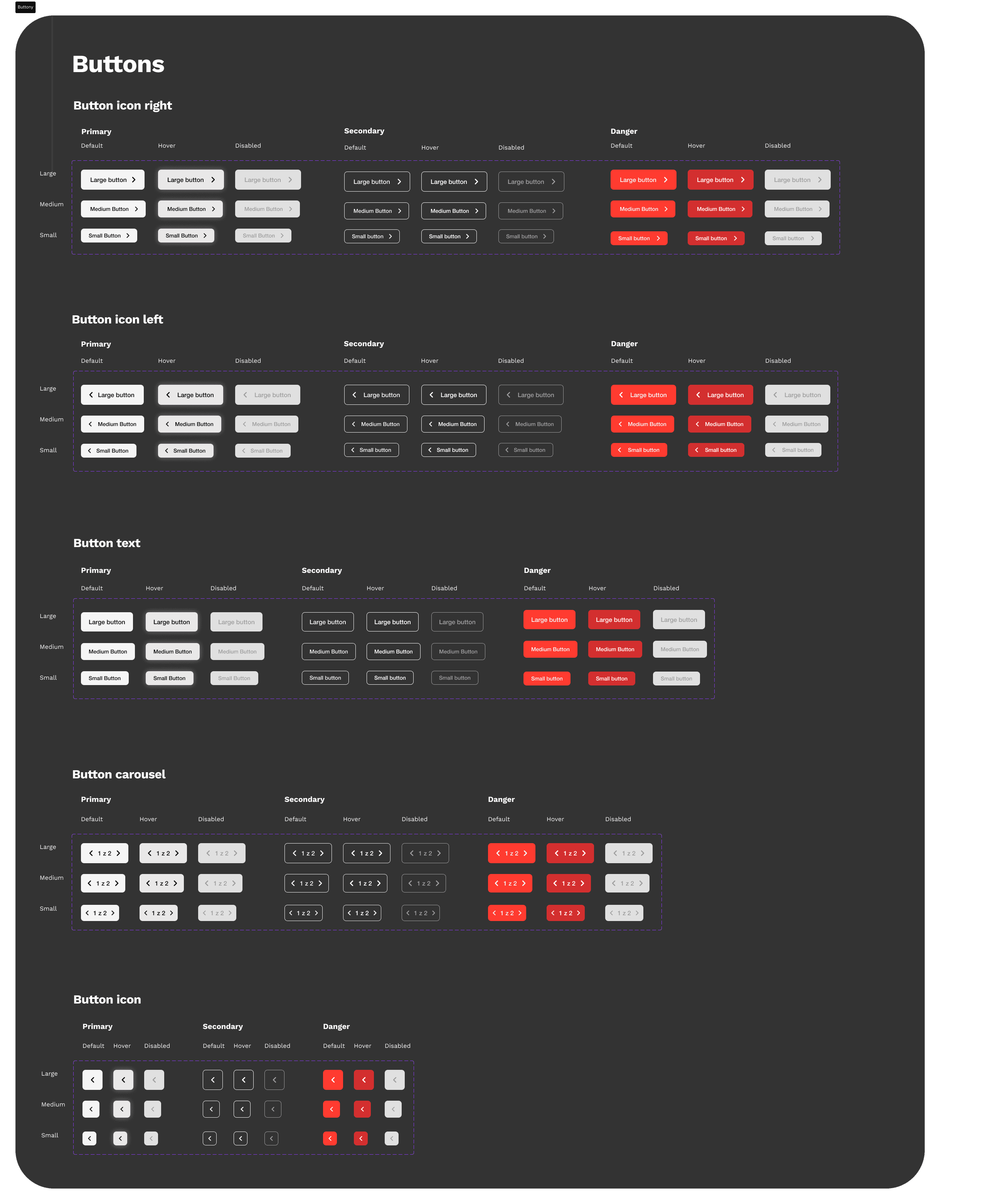
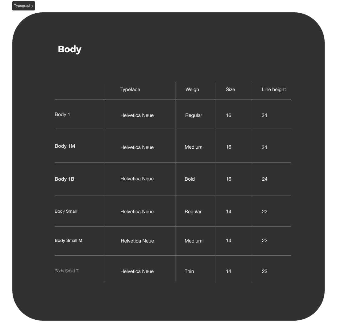
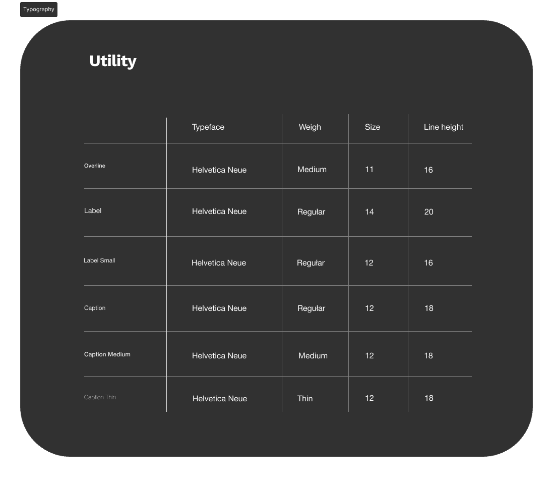
Design system
To create the high-fidelity mockups, we defined the foundations of the design system, including colors, typography, and core components. We used the PMI Brandbook and adhered to WCAG (AA) accessibility guidelines. Below, I present the component variants required to build the interface.


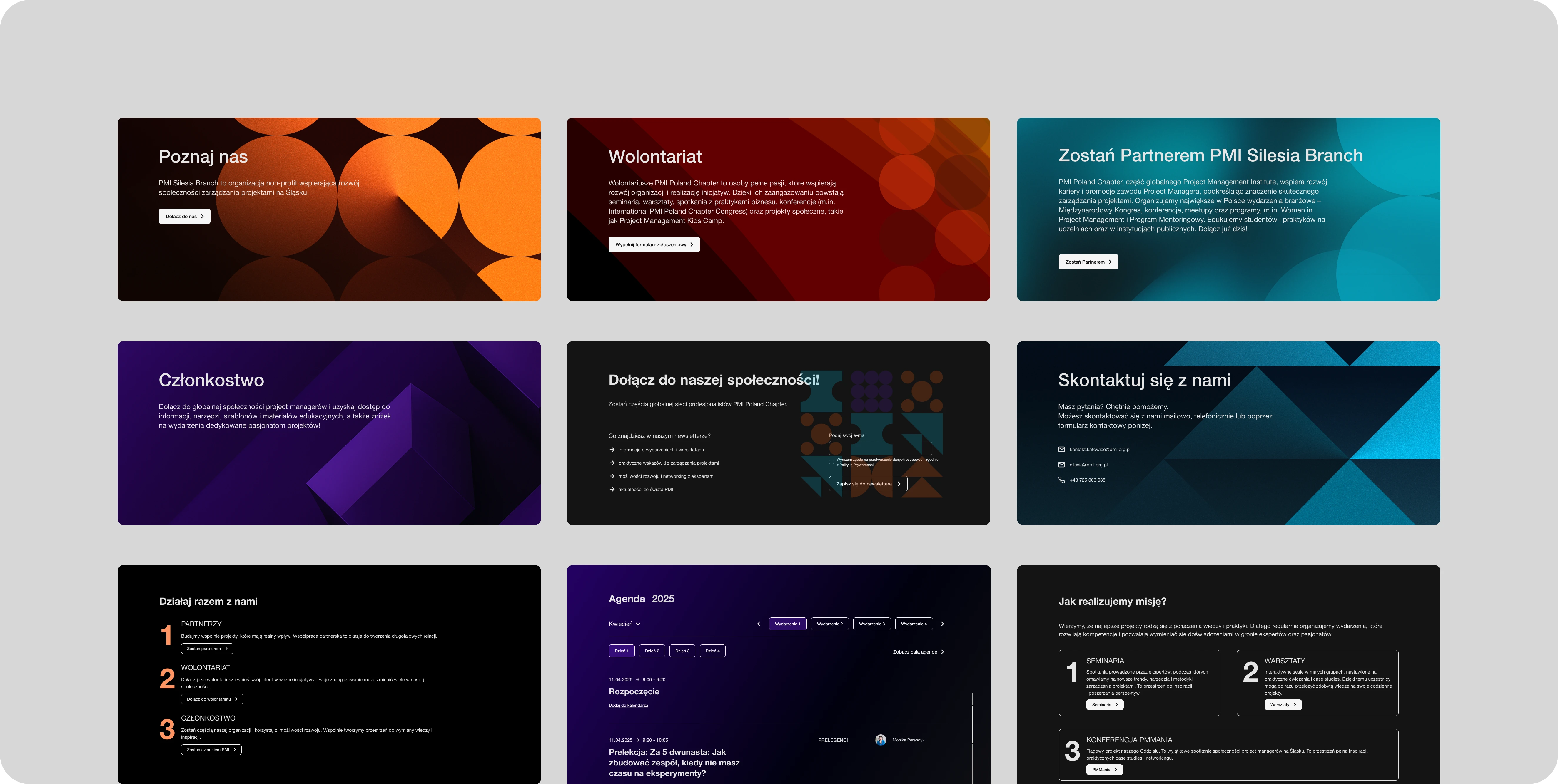
High-fidelity wireframes
After creating low-fidelity wireframes for the main flows, focused on structure and real content, we progressed to high-fidelity wireframes. During this stage, we established the visual identity, including typography and a color system aligned with the brand guidelines while following UI best practices
Decisions
Event Agenda as a Key Element
The goal of the redesign was to improve readability, accessibility, and ensure the agenda works well across different devices

3
2
1

4
Using cards and time blocks
eliminates the "wall of text" effect
makes it easier to compare sessions quickly
naturally guides the user's eye down the page
Information hierarchy
Time - the most prominent element
Session type (lecture / workshop / break)
Title and speaker
Additional details - available without cluttering the layout
Information hierarchy
Color coding with contrasting blocks lets users quickly scan the entire day and understand its structure without reading every description line by line.
Consistency across desktop and mobile
Desktop
the wider layout allows users to see the entire day at a glance
clear spacing improves readability and browsing comfort
Mobile
the agenda stacks vertically
elements are easy to tap with a thumb
no horizontal scrolling or unnecessary interactions
This ensures a consistent experience across devices, which is crucial for events that are often checked on the go