Work Zen Connect - Mobile App
Work Zen Connect is the final project for people working remotely/hybrid. The application aims to support remote workers in organizing their workday, while taking care of comfort and life satisfaction in all 3 areas - physical, mental, social. It emphasizes building relationships between employees and reminds us to take breaks, during which we can take care of our body and mind, thanks to short exercises, which are available in the form of several-minute videos.
GOAL
Support for people working remotely who are experiencing more and more negative effects.
PROBLEM
How to help those working from home take care of their health and quality of life?
FOR WHOM?
For those working remotely/hybrid.
For corporations and freelancers.
MY ROLE
Highly involved at every stage of the project, leader at the researching, modeling and prototyping stage
TEAM
DURATION
9 months
METHOD AND PROJECT
Double Diamond Process, User - Centred Design

Improve your remote work with the app.


GOAL
To become the leading app for people working remotely/hybrid
70% of users extend their subscription
80% premium users
Increased user satisfaction
KEY RESULTS
How will I know that the goal has been achieved?
Customer retention rate (measured quarterly)
Increase in the number of downloads, new, paid registrations
Monitoring opinions and comments
Estimation

How many people are employed in enterprises in Poland? - 6.5 milion (data from the Central Statistical Office)
How many people work remotely? - 7%, that is 455,000 people (data from the Central Statistical Office)
What will be the subscription amount that the employer has to pay for the employee? I assume 10 PLN (a rough initial estimate)
How many remote workers will use the application after a year from the launch? I assume 5% of the market, that is 22,750 users. In the 12th month from the premiere, there will be 227,500 PLN in revenue (this number doesn’t represent net profit)
AFTER A YEAR
USERS
PLN
UX Strategy Brief
Individual in-depth interviews (IDI’s)
GOAL
Responded
9 people: 8 Generation Y (28-43 years) 1 Generation X (44-59 years, Manager)
Tools
Google meet Miro Exel
Netnographic research
Why?
This is a great space for UX design.
Based on research by NTT DATA Business Solutions (2024), employees do not want to completely give up their offices.
Quantitative research
24% of employees report feeling lonely
86% of remote workers say that working on their own increases productivity
40% of remote workers feel that after switching to remote work, they spend more time on it than before
Benchmark - indirect competition analysis
Productive (habit tracker app)
PROS
personalization
daily challenges to increase motivation
modification of notifications
CONS
complexity of the interface
too many questions to complete - which can be discouraging
lack of integration

Benchmark - hybrid competitive analysis
Alarm (clock app)
GOAL
Implement simple solutions in use.
„Users spend most of their time on other websites and they prefer yours to work the same as all the others they already know.” Jacob's law


Three Voices
VOB (Voice of Business)
revenue in the 1st year after launching the service
profit in the 3rd year after launching the service
VOC (Voice of Client)
integration
friendly relations
self-discipline
good daily organization
lower team turnover
VOM (Voice of Market)
mobility
synchronization
work-life balance
usability
accessibility
Persona 1

Persona 2

Storyboard with AI


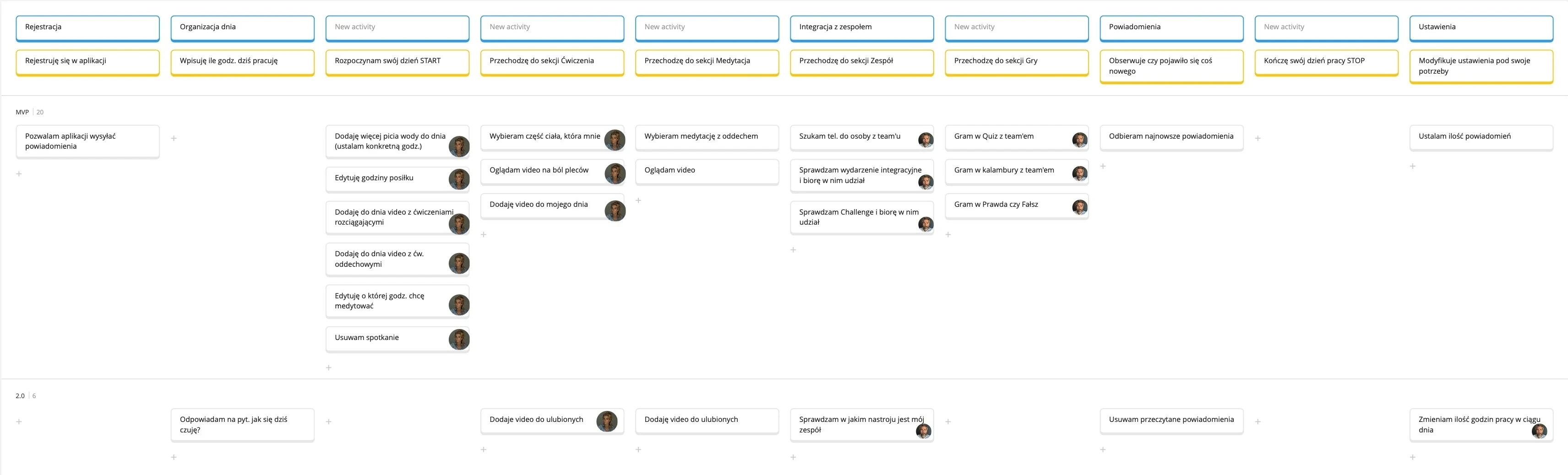
User Story Mapping
GOAL
To clearly organize ideas and turn them into actionable, real user needs.
`WHY?
Because understanding users better leads to better products.
Content structure - Card sorting closed
GOAL
Building a more intuitive and easy-to-navigate information architecture (Tab bar)
WHY CARD SORTING CLOSED?
limitation: max. 5 categories in Tab bar
eliminating possible large differences in results
minimizing rough categorization
difficulties in later analysis
desire to obtain more precise data
finding a potential problem

Research results from optimalworkshop.com
10 USERS
8 Generation Y (28-43 years), 2 Generation X (44-59 years)
TOOLS
optimalworkshop.com
Results analysis - card sorting
After the study, I made a change:
Adding an additional subcategory (Games) to the Team Category.
This change will systematize the Team category, in which not all subcategories were logical for users.
They wrongly assigned for example Charades or Quiz to the Mind category. They explained their answer by saying that the games listed above engage the brain.


Content structure - Tree testing
GOAL


Research results from UXtweak.com
10 USERS
6 Generation Y (28-43 years), 4 Generation X (44-59 years).
TOOLS
UXtweak.com
Wireframe Lo-Fi

Usability testing with users
GOAL
Detect as many errors as possible in the shortest possible time and minimize costs for the business
After completing the study, I asked them to:
complete the System Usability Scale (SUS) survey
indicate what emotions were present before/during/after the study (Premo emotion cards)
provide an example of a cartoon character they would identify with the app
Research conducted on a prototype of a mobile application (Work Zen Connect) in the Figma program
Design decisions
01 Contrast ratio WCAG
02 Intentional delay
A short, intentional delay (1,5 s ) was introduced before displaying the main screen to support the user’s perception of personalization. Crafting a narrative that makes the user feel cared of [1].

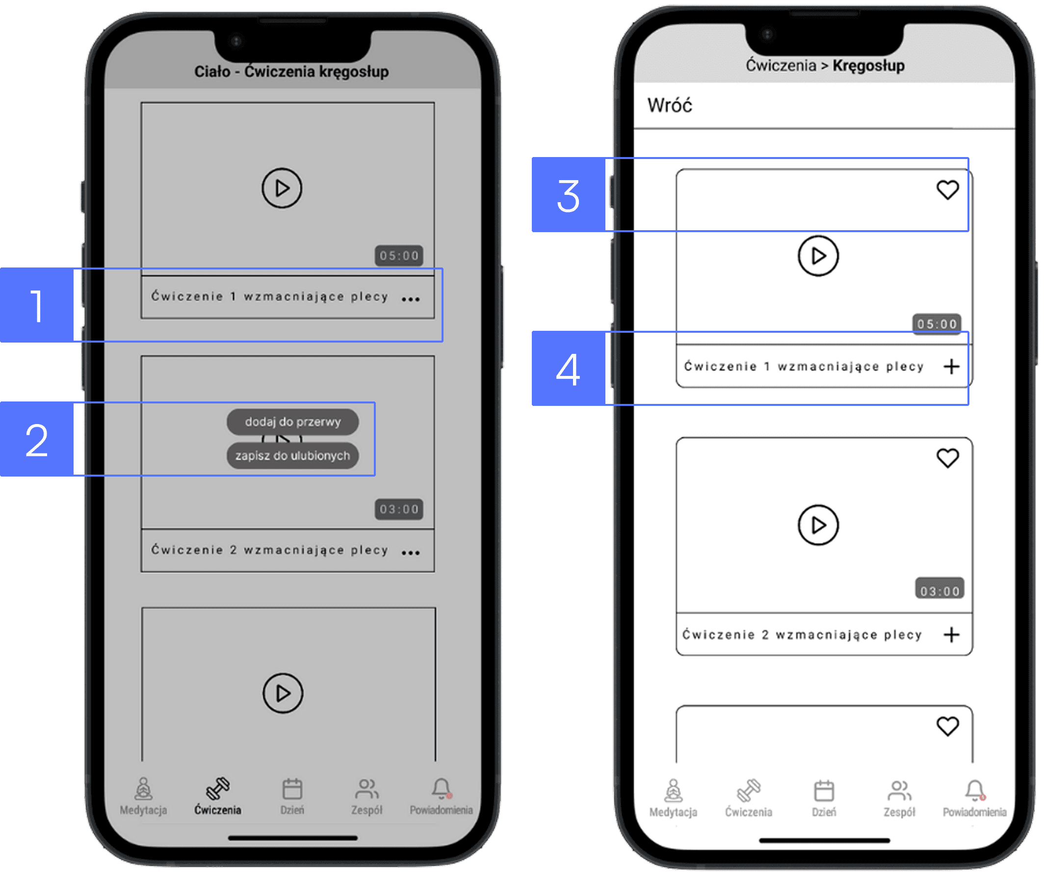
03 Multi-path access
To improve access to a key function, we added a “+” icon as a third entry point [1]. Tapping the “+” icon [1] reveals a contextual menu [2] with options that can be added to the timeline. This allows users to reach the same action in three different ways [3], [4], which:
supports diverse navigation habits and mental models
reduces the number of steps for advanced users
increases the sense of control and overall intuitiveness


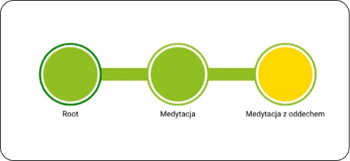
04 Tap bar design
The tap bar [1] includes the most frequently used and key features that users need daily:
Meditation - users can add relaxation exercises is dedicated to people who feel overwhelmed
Workout - helps users take a break and reduce muscle tension or pain caused by long periods of sitting
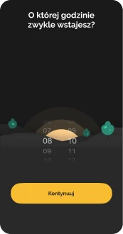
Day (Timeline) - support users in organizing and following their daily schedules. It’s the app’s primary screen and central point of interaction
Team - users can connect and engage with co-workers through shared events, activities and informal interactions
Notifications - remind users about important events or tasks throughout the day, helping to reduce cognitive load and free up mental space

Improvements made
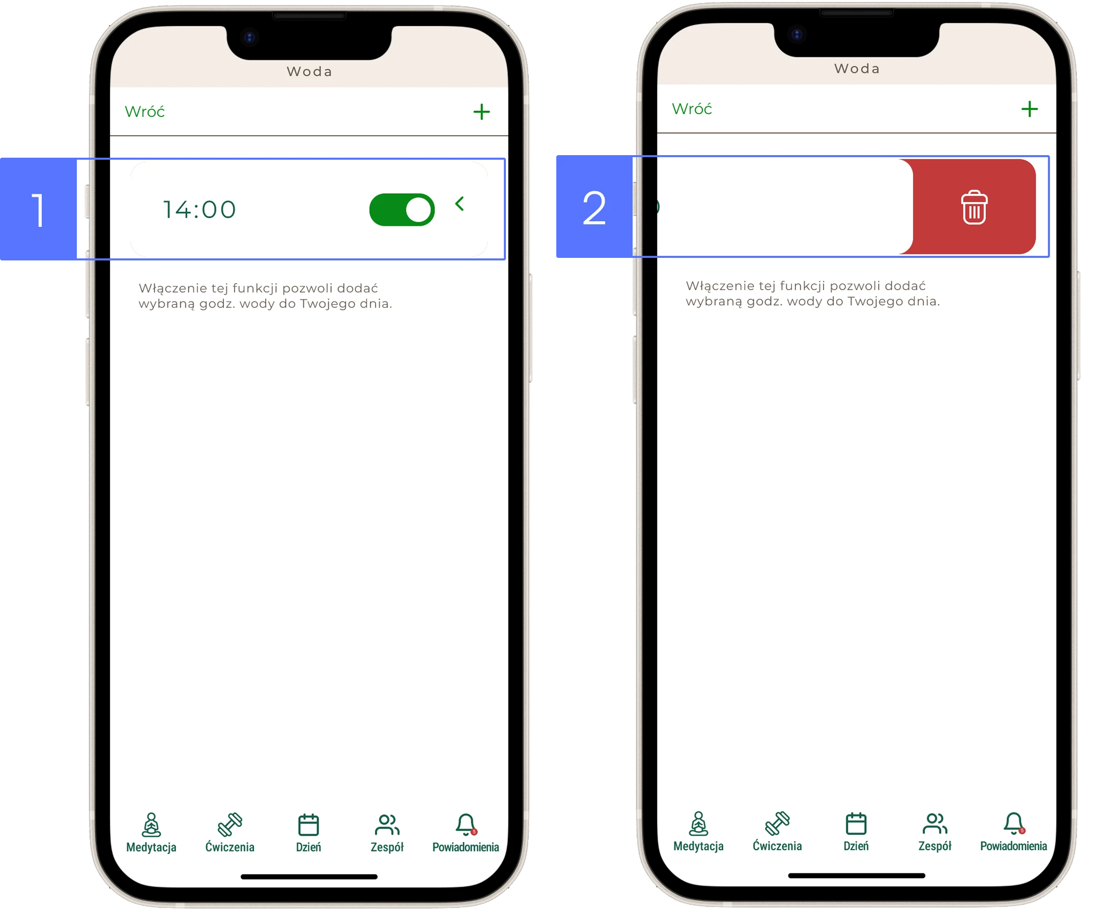
01 START/STOP icon setting – too few available
Huge Problem
The START/STOP icon at the top of the screen is inconvenient to use. It's placed too far from the user's fingertips [1]
Recommendation
I recommend setting the START/STOP icon in an area of greater access/range. On the left side at the bottom of the screen [2]

02 Adding video to the Day
Minor Problem
The presence of the “play” icon often encouraged users to click in the center of the screen instead of on the “three dots” icon on the right side [1]. Clicking the “three dots” icon allows the user to add the video to a break or to favorites [2]
Recommendation
We recommend replacing the “three dots” button with a “+” button, positioned on the right side of the video [4]. The button for adding to favorites (represented by a heart icon) should be located in the top right corner [3]
03 The icon ”<“ is not tappable, it works only as a swipe gesture
Medium Problem
The user tapped the icon “<“ several times instead of swiping [1]
Recommendation
I recommend two ways of interacting with the icon “<”: swipe and tap to improve usability [2]
04 Daily schedule visible only after clicking the “Day” icon
Medium Problem
The user does not remember his daily schedule when he selects the time in which he plans, for example, exercises
Recommendation
I recommend creating a "Show day" pull-out tab to make as little reference to the user's memory as possible
What’s next ? - continuous optimization
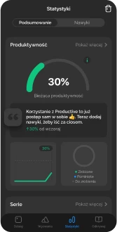
Continuous optimization can be effectively guided by the HEART framework, helping to improve user satisfaction, engagement and overall product performance.

Lessons learned
Teamwork requires emphasis on communication skills, assertiveness, emotion control
Test the design as quickly as possible. Testing early with imperfect versions will save time and minimize costs for the business
Good design requires many iterations
Conducting user research adds great value to the project and allows you to look at the project from a different perspective
Take me to the top